Marketing
Burger King rebrands for 1st time since 1999
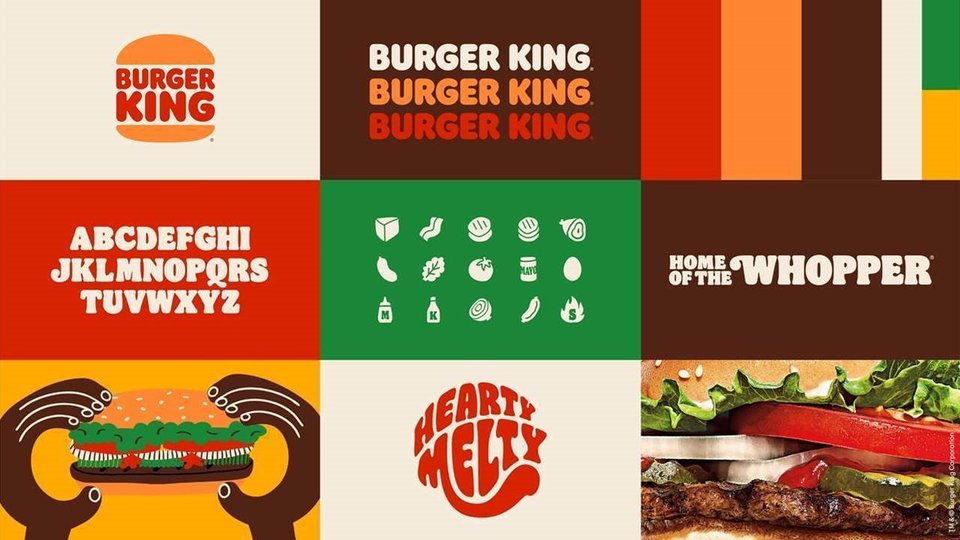
For the first time in more than 20 years, Burger King is launching a new logo and look.
January 7, 2021
 ChatGPT
 Grok
Grok Perplexity
 Claude
It's got a bit of the funk and fun of the early '70s, along with a modern twist reflective of a brand that is insistent on not taking itself too seriously. And today it becomes reality.

"It" is Burger King's new branding that's not too far a departure from the chain's current look, but still moves solidly forward for the modern audience.
"The Burger King brand is all about real, simple and delicious food, and our new logo communicates that with confidence," said Rapha Abreu, global head of design for Burger King parent company, Restaurant Brands International, told QSRweb.
"It pays homage to the brand's heritage with a refined design that's bold, simple and fun. The letters are rounder, friendlier, and the buns have more realistic proportions closer to our burgers. The colors are warmer, and more appetizing. We want to ensure we are creating a timeless logo that looks great today and will keep looking great 20, 30 years from now."
The company said the new look — the brand's first in more than 20 years — will surround customers at every touchpoint and represents Burger King's values, including a commitment to digital-first expression and improvements to taste and food quality. The brand has previously executed on those tenets, it said, by removing artificially sourced colors, flavors, and preservatives from menu items (Remember the molding Whopper?), as well as its pledge to greater environmental sustainability.

Included in the rebrand are a logo revamp, as well as changes to packaging, merchandise, menu boards, crew uniforms, restaurant signage and décor, social media and digital and marketing assets. The brand said in a news release that it believes the new image speaks of confidence in the future, while remaining true to Burger King's heritage through the following aspects:
- Logo: The brand said the "minimalist" logo reflects its food and the industry's transition to more modern, digital-friendly design since the current logo launched in 1999.
- Color: Inspired by the flame-grilling process and fresh ingredients, the brand said the new photography is hyper-textured and highlights the food's sensorial qualities.
- Font: The proprietary brand font, called "flame," was inspired by the food on the menu, "rounded, bold, yummy — and brand's irreverent personality."
- Uniforms: Uniforms reflect flame grill-masters, and are featured in TV spots worn by true BK crew members.
- Packaging: Logo-centric with bold colors and playful illustrations of ingredients.
"Design is one of the most essential tools we have for communicating who we are and what we value, and it plays a vital role in creating desire for our food and maximizing guests' experience," Abreu said. "We wanted to use design to get people to crave our food; its flame-grilling perfection and above all, its taste."
Guests will start seeing the new visual identity at the beginning of 2021. Over the next few years, Burger King aims to implement the design at its more than 18,800 restaurant locations worldwide.
Inset images: Provided
Related Media
Subscribe
Get the latest news and resources from QSR Web.
Recent Posts