News
MaggieMoo's intros new product packaging
May 7, 2008
 ChatGPT
 Grok
Grok Perplexity
 Claude
NEW YORK — NexCen Brands Inc., parent company of MaggieMoo's Ice Cream & Treatery, has unveiled a new package design for MaggieMoo's "to go" containers.
The new design showcases images of MaggieMoo's ice cream. The images are intertwined by idioms of "sharing" on the quart, and declarations of "just for me" on the pint. The new design also displays the MaggieMoo's logo, which spotlights mascot Miss Maggie Moo. The artwork is supported by a two-tone pattern exemplifying the brand's personality in magenta for the quart and blue for the pint.
Both the quart- and pint-size containers are labeled on the lid by hand as a reminder that MaggieMoo's ice cream is made fresh in the Treatery.
Related Media
Subscribe
Get the latest news and resources from QSR Web.
Recent Posts

Toast releases Q4 trends report, February price monitor

White Castle partners with Serve Robotics to deliver through Uber Eats
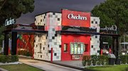
Checkers & Rally's opens 2nd of 3 Las Vegas restaurants

HTeaO to make a splash in Gun Barrel City, Texas
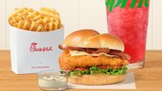
Chick-fil-A intros Jalapeño Ranch Club Chicken sandwich, Strawberry Hibiscus beverages

