Operations
Sonic 'booms' into future with 'oasis' in QSR design desert
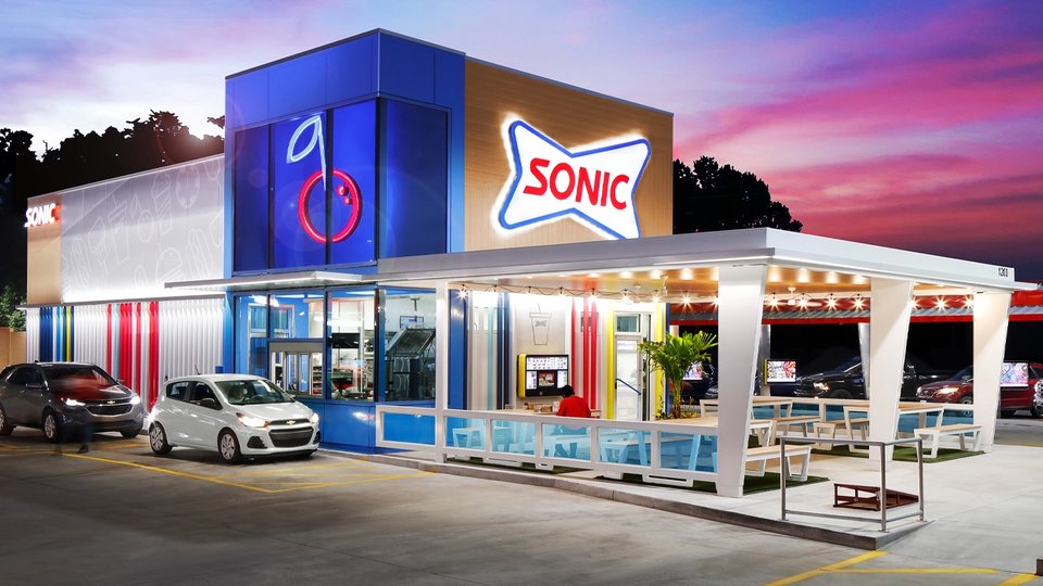
Shortly after Inspire Brands acquired Sonic Drive-in about 1 1/2 years ago, it began reimagining the brand for the future. That new look has taken shape in a small Oklahoma town and comes with a blue light and a cherry on top.
August 4, 2020 by S.A. Whitehead — Food Editor, Net World Media Group
 ChatGPT
 Grok
Grok Perplexity
 Claude
For all its negative effects on the restaurant industry, the pandemic can be credited with at least one positive. It has sent scores of restaurant-starved customers in search of a drive-thru to quench their thirst and quell their appetites at a time when touching just about anything is risky. Enter the nation's largest drive-in brand, Sonic, which recently embarked on a makeover to create what the brand's leaders see as an"oasis" in a desert of fast food restaurant sameness.
 |
| Sonic's new tower of light marking its drive-thru.(Photo: Mark Steele / www.marksteelephotography. |
The brand — which has always had a bit of a retro design slant in deference to its 1953 founding and carhop-infused kitsch — has opted to jettison itself into the future with an intensely bold reimagining that recently emerged in its first physical embodiment in Tahlequah, Oklahoma, which appropriately enough, has the city motto of "City of Firsts."
In that 15,000-person community in the foothills of the Ozarks, Sonic's new image is lighting up the night sky of Cherokee country with an intensely shaded drive-thru tower of indigo light, adorned with a fire-engine-red neon cherry, calling customers in for one of the brand's brightly colored blue slushes and cherry limeades.
From retro to futuro
The brand's reimagining began less than 11 months before the pandemic changed every QSR's "business as usual," and less than four months after Inspire Brands' December 2018 acquisition of the drive-in brand. That's when Sonic hired southwest Ohio-based design company, ChangeUp, to rebrand it.
"They (Sonic and Inspire Brands' leadership) have been working internally on a pretty dramatic strategic shift for the brand to really move from a nostalgic sort of space to more in what they are calling a sort of 'oasis space," Ryan Brazelton, executive creative director, ChangeUp, said in an interview with QSRweb.
"If you … think about how they were being perceived with that look, they were seen as retro and the style seemed old-fashioned, but kind of cute and campy. But they wanted to move away into a new a new fresh face to really reintroduce the brand. … And it was all around this kind of notion of an oasis and summertime anytime. … and leaning into colors, like red and blue for hot and cold treats… It is unlike anything else in the space.
Brazelton said that Inspire Brands leadership and Sonic President Claudia San Pedro called for that new image to visually live up to the brand's promise to customers — to be a fun, relaxing place for a break and a bite like going to the beach in the summer.
"It was really exciting to get to do this with Sonic. It was also exciting that the client was brave enough to go this far … because this experience – there's just nothing else like it."
-Ryan Brazelton
"So their insight was really to think about how customers use (Sonic) and … the role that Sonic played in people's lives," Brazelton said. "That was really the fact that (Sonic) was an oasis, especially in the parts of the country where Sonic really is often in a more rural environment.
"It's a place you can totally take the family and give them a special little memory, a little escape. That really is at the heart of what they offer and they wanted to bring that to life."
To achieve that vision, ChangeUp did a bottom-up re-envisioning of the brand, building the look around the monolithic-lighted drive-thru tower, then extending it to an assortment of striped panels along the exterior. Drive-in bays — once called "stalls" — have been redesigned as "docks," to again connote that beach-y, summertime all-the-time feel.
That theme is continued with an assortment of outdoor covered and uncovered patio dining areas for customers who want to dine in without exposing themselves to the risk of COVID-19.
Although the reimagining was well on its way when COVID-19 hit the U.S. in March, the new look and features happen to take advantage of the same things that pandemic-weary customers are now demanding — like pleasant ways to eat in or order from their cars, as well as lots of outdoor dining space.
 |
| Sonic's new outdoor covered dining space.(Photo: Mark Steele / www.marksteelephotography. |
"The reality is that really the bow was put on this work really prior to COVID-19," Brazelton said. "Interestingly though, in just thinking about (Sonic's) design … it's really like 'back to the future.' It's ahead of its time because … COVID has highlighted the almost perfectly built system that Sonic already has to deliver to customers in a time like this."
Sonic also had a more efficient kitchen revamp underway pre-pandemic, which feeds directly into the new design to expedite order-processing via drive-in, drive-thru, patio dining and delivery.
Does the redo do what it's supposed to?
The big question though and the reason behind all this reworking — which Brazelton actually said is cost-neutral with the old design — is whether the new look is actually pulling in more people and orders. The answer — at least in Tahlequah thus far — has been an unequivocal, yes.
"Sonic is really doing very well through COVID — the whole system is. But, having said that, this (Tahlequah store's business) is an additional 60% to 70% on top of every other Sonic," he said. "Like we built a bigger freezer there because the deliveries can't get there fast enough. … There are two Sonics in that one town and they're both doing well, but this (reimagined) one is doing much better.
"The other thing is that every competitor is there as well, so it's a nice test market. Then obviously the next one is in Dallas… which might be their biggest market. So they've got kind of a hometown market to start with and then they're going into the biggest market with it."
Sonic is building five locations with the new design and then will start retrofitting older stores. Although the brand didn't release a time frame for the redesigns. Brazelton said franchisees were excited about the new look and the flexibility.
Brazelton is most excited about the fact that the rebrand is a new look for the QSR market, which should resonate with customers.
"QSR design now, I think is, for the most part, driven by 'love letters' to either McDonald's or Starbucks because the reality is that almost everyone in the (fast food) space is doing some type of iteration of those core concepts. …" he said.
"But then it becomes difficult to stand out. ... So it was really exciting to get to do this with Sonic. It was also exciting that the client was brave enough to go this far … because this experience – there's just nothing else like it. … That drive-thru tower -- that blue glass tower with the cherry on it — as just a designer, I think it really lights up the night."
About S.A. Whitehead

Pizza Marketplace and QSRweb editor Shelly Whitehead is a former newspaper and TV reporter with an affinity for telling stories about the people and innovative thinking behind great brands.
Related Media
Subscribe
Get the latest news and resources from QSR Web.
Recent Posts