Article
Burger King goes pop
New packaging initiative emulates Andy Warhol-inspired art.
August 1, 2010 by Alicia Kelso — Editor, QSRWeb.com
 ChatGPT
 Grok
Grok Perplexity
 Claude
* Click here to view a slideshow of images of the new packaging.
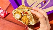
The classic, juicy Whopper may taste the same, but something about it sure does look different.
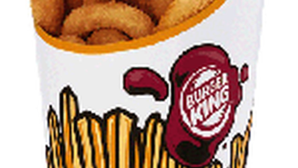
No need to be confused, however, it’s just the packaging. Burger King recently rolled out a new design initiative emulating the “Pop Art” movement of the 1950s.
According to a Burger King spokesperson, the packaging is based on the memorable period with an updated twist.
“While the designs are based on this iconic movement, they take on a thoroughly modern form and highlight the quality and appetite appeal of our products,” the company said.
The project began in the United States at the end of fiscal 2010 and is being rolled out worldwide beginning in fiscal 2011.
It has been rolled out in all U.S. restaurants and, so far, has been incorporated onto Burger King bags, cups, Frypods (a french fry container shaped to fit in a car’s cupholder) and sandwich wraps.
Also, because the packaging has been designed specifically to minimize the use of copy, it will be easier for it to be adopted internationally.
While Burger King’s merchandising efforts are continuously evolving, the company plans on implementing the packaging permanently.
“We do not intend for this design to be a limited-only effort,” the company said.
Burger King’s packaging efforts follow what has been a trend for the past couple of years.
McDonald’s introduced a new line of global packaging at the end of 2008 – the company’s most comprehensive rollout in its history.
Earlier this summer, Seattle enacted an ordinance requiring restaurant packaging to be recyclable or compostable.
Also, according toDarrel Suderman, Ph.D., president of Food Technical Consulting and founder of Food Innovation Institute, a recent survey sponsored by Institute found that food packaging innovation was one of the top 10 requested workshops by research chefs and food technologists.
Burger King’s packaging facelift comes in the middle of its companywide redesign effort. The effort, called “20-20,” is based on a contemporary theme and includes elements evoking an industrial look.
Although the packaging initiative is a separate effort, a Burger King spokesperson said it fits nicely with the 20-20 elements.
Burger King has delved into packaging innovation before, albeit with temporary campaigns. For example, in March, Burger King customers in Brazil could take part in WhopperFace, in which their photos were taken by a hidden camera and reprinted onto their Whopper wrappers.
About Alicia Kelso

Related Media
Subscribe
Get the latest news and resources from QSR Web.
Recent Posts